Showing posts with label liverpool. Show all posts

Sunday, 21 November 2010

Too much thinking for this ol' fuddy-duddy

Well, it's been a while and I am now in my final year at Glyndwr University, still plodding onwards. I wont bore you with the details of the last two months, suffice to say that Orlando was riotous fun! I'll dive straight back in with my November blog...

About a fortnight a go I scurried off to Liverpool for a good dosage of culture, as the 2010 Biennial was being held. With various galleries and museums participating in the festival, it seemed like a great time to have a nose and see what was new in the arty-farty world. I headed over to the Walker Art Gallery to check out a painting competition.

For a student of the arts, I find it very discouraging that the majority of these competitions still focus on pompous nonsense when it comes to works of "art".

I was, for the most part, disappointed with this year's John Moores Painting Prize. Whatever happened to painters actually being able to paint? It seems that any so-so can chuck a blob of acrylic onto a canvas nowadays if there's an "idea" behind it. "Oh, it represents the randomness of life." Get over yourself.

Honestly, there were only two or three paintings even deserving of the £25,000 prize, and you can bet your bare arse none of them won because the meaning is too obvious.

"Protest, 1st April 2009" by Nicholas Middleton is a beautiful painting, done in monochrome, of a crowd of people at a rally. The expressions and details are so mesmerising it's almost like looking at a photograph, but the tiny brushstrokes hint at the human talent behind it. I could practically hear the noise of the crowd whilst gazing into it.


Christian Ward's "Frontier Monument" spoke less of obvious talent, and more of imagination. The lack of perspective is overshadowed by the painting's mad colour scheme and landscape. It's a Nirvana that I would have pictured as a child, but that's not to say I wouldn't want to dive into it now. I think my fascination with this one is it's resemblance to something out of "Yellow Submarine". Whilst I was looking at it a group of children ran over to it, exclaiming that it was their favourite. "There's lots of purple", "look at the lovely trees" and "I like the squiggly-armed guy" were some of the phrases they used. I think when a child "gets" your work, then that's something to be proud of.


"An Alpine Biodome" by Geraint Evans was an interesting piece. Not something I would have on my wall at home, but well executed and an obvious example of work by someone who I imagine would do well in design and architecture.


"Near the Site" by David Fulford is, I think, worthy of a mention because it comes across as as storyboard. I couldn't quite make out the story, but I loved the colour scheme of a Sunday afternoon in the summer; all dull yellows and browns. Even without a story the pieces stand individually as photographs, as though someone has hurriedly painted them to capture a moment in time. There were 60 small canvas paintings in total, and another reason it bodes well with me is because the idea relates to one of my Negotiated Study projects.


Finally, it's worth mentioning that there are five extras this year, as the JMPP celebrates a new venture by opening the competition in Shanghai. My favourite of the five shortlisted was Li Weizhou's "Where are we from? Where will we go?" From a distance it looks like a large blank canvas with a tiny queue of people running across it, but close up, you realise that these tiny people all look completely different, and all appear to have personalities about them. I also loved this painting because of the medium used: ink on rice paper. That's new to me, but the effect is beautiful and works for the enigmatic piece.

So there were some really great pieces, including ones that I haven't mentioned, but the majority I will not dignify with a mention, because then they get free advertising. I honestly believe that if, as artists, we allow our craft to be exploited and tarnished this way, then our livelihood is going to fade very fast.

To finish off, I will put in a mention for this wonderful little blog post that kept me smiling, even when I felt done-over by the artwork thinking I don't have a chance. If you're worried that you may not pan-out as a full time artist, whatever your creative pursuit, have a gander at this list of ways to know if you truly are an artist. Hopefully it'll put some minds at ease.

Friday, 16 July 2010

Lost In Liverpool Tweets


It's been a while since I've posted anything, but now it's officially the British Summer Holidays, it's time for me to get off my anatomy and work hard.

Last week I ran away to Liverpool. I'm quite fortunate that my Dad works and has a house there, so I can pretty much escape whenever I want. Saying that though, a single from Liverpool Central to Chester Station only cost me £4.35.

Anyway, on the Wednesday morning I visited the Tate Liverpool, which I've never been to before. I was expecting the usual pompous "art", and there was some, but I did find quite a lot of work that I really liked. I also tried something new to me and "Tweeted" my discoveries via my iPhone, which kept my friends and family up-to-date with what I was getting up to, and helped me keep track for my blogs.

Here you can see what I "Tweeted!"

Wednesday 7th July 2010

9am
"A warm breeze blows over the stank of the river Mersey. The Albert Dock is silent and still, but for a few early morning stragglers on their way to work. I am on my way to inspiration, a foreboding sense of failure filling me nonetheless. But first, I need a cup of tea."

9.37am
"The Tate Liverpool offers an exhibit on Pablo Picasso. I wouldn't say I'm his biggest fan, but I am in the mindset for looking at things from a "different perspective" today. And so I will give him the chance to teach me something. Everything is closed until 10, so I will spend a good half hour in Costa, listening to jazz. Already I'm feeling sleepy..."

10.25am
"So the Picasso "peace and freedom" exhibit is off limits. I cannot afford the £8 ticket. It's a shame that one must pay to SEE art, but I suppose one has to make money some way. I was tempted by the young lad on the door to take a job here myself. Imagine: working in a museum or gallery; constant change and diversity. I would be inspired 24/7. Either the tedious artwork would make me want to show off my own, or the fantastic pieces would encourage me to prove myself..."

10.35am
"I'm sat in an exhibit by one Rineke Dijkstra, called "I see a woman crying". The videos record several school children's reaction to Picasso's "weeping woman" piece. I'm sitting alone in this big dark room watching an 8ft screen on which a young girl - slightly overweight, brunette bundles in a ponytail, not quite unlike myself at her age - scribbles away at a sketchbook with a look of earnest concentration on her face. I'm reminded of how I used to be: determined to produce a good drawing, but ultimately not caring what anybody else thought of it. Sadly I do not get to see her finished work."


10.47am
"In the next room, a video is filmed from three angles, featuring a group of children commenting on the "weeping woman". I'm surprised by how attentive and genuine the little Scousers are, coming out with comments such as she's "lonely", "abandoned", "upset that she's the only one that looks that way" or a "ghost". Others make interesting note of the colour scheme, saying "there's lots of blue and purple" and "maybe Picasso just wanted to paint something colourful". But my personal favourite was that she "owes money". Gives you a good idea perhaps of how these city children were brought up. Incidentally, I have never seen this painting, but I will be seeking it out to see how their comments compare to mine."


10.54am
"As much as I've enjoyed the "I can see a woman crying" exhibit, to call it ART is a bit of an overstatement. It is more along the lines of an intriguing documentary. I think what singed me the most is how much this filmmaker has probably been paid to do something that the average film student could do in college. It seems almost effortless, and for that reason I am evermore irked by the Tate Museums. By all means display works like this, but don't put them up on a pedestal against work that has been painstakingly created through real talent."

Friday, 30 April 2010

Music + Art = Love

This Music as Product brief is gonna kick so much tooshie (I’m trying to be more professional by not swearing in my blogs… let’s see how long it’ll last…)!

Seriously, I’m very excited; I’ve already unconsciously been preparing for it, as I’ve been aiming to design an album cover for Taste the Blood for a while now. But also because I have so much free reign to be myself, discover new art and get really creative in the process.

The project is simple: create a vinyl cover for a band album, whether real or fake. Make the album cover as interesting as possible, with added gifts and collectables, whilst also making sure the product can be batch produced five times or more. That works out great for me, as I’ll then have one copy for myself, and one each for the members of Taste the Blood.

I love a good album, but I love an album even more when there’s something super special about it. These are the ones I usually go out and buy. For example, every Gorillaz album and, my most recent purchase, Paramore’s Brand New Eyes Deluxe Edition, which I picked up for a cool £34.99. These are both great examples of well packaged music for the major fans. The Gorillaz D-sides album included pin badges, stickers, a sew-on fabric badge, and sketches by Jamie Hewlett, whilst Brand New Eyes had a DVD, a 7” vinyl with acoustic versions of two songs, Hayley Williams' journal, a double-sided poster and photo-cards, not to mention a certificate of authenticity.


It’s amazing what more they can do with music, and there’s nothing better than opening a brand new album, especially if it includes loads of freebies.

So I will be working with Taste the Blood, a Wrexham-based Metal Band in which my boyfriend plays bass, to produce something they can be proud of. They very kindly gave me a list of things that influence and inspire their music and their look, which threw up some very interesting concepts: German expressionist cinema, Bauhaus, cubism, Hammer Horror, 1950’s pop art and B-Movies were but a few of them.


When I mentioned their influences to Dan Berry, he pointed me in the direction of Charles Burns and told me to have a look at Black Hole, a comic about mutated teenagers. I've seen some of the pages online, but what really intrigued me about the story was that a photographer called Max Oppenheim has taken stills of some of the comic's mutated characters and used prosthetics to turn them into realistic, horrific year book photos. It's really disturbing, but ultimately brilliant, and works for an idea my boyfriend had of doing each of the band members as famous monsters (Dracula, Frankenstein, etc). Will have to look into this more, but you can check out the rest of those creepy photos here.


I love the idea of exploring old-school horror cinema and advertising. It gives me the chance to steer away from the typical Metal album cover ideas, which usually feature big hairy guys who look like they’re going to murder you. I’ve been looking into album cover design for a while now and I’ve come across some great, and sometimes controversial, pieces of work.

The Scorpions – Virgin Killer: Do I even need to mention why this is one of the most controversial album covers of all time? And yet it does what the title says. I think the glass effect is fantastic, but I’d be much more careful working with kids like this.


Iron Maiden – Killers: Iron Maiden are known for their awesome album covers, featuring their mascot, Eddie. This album cover is my personal favourite, drawn by Derek Riggs. I love the grungy cityscape, the bright, morbid colouring and Eddie’s cheerfully psychotic smile. Classic.


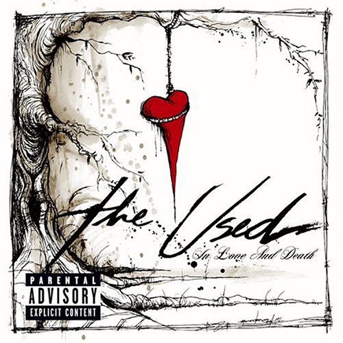
The Used – In Love and Death: The album artwork here is done by Alex Pardee. I love how simplistic his use of line and colour is. It’s creepy and yet still whimsical. Very Tim Burton.


Gorillaz – Plastic Beach: I couldn’t go on about album covers without throwing them in somewhere. The album cover for their latest album is the most extensive in terms of artwork, and also the most colourful.


I have, of course, more influences than this but I’m trying to save space!

So, not only do I have to do an amazing album cover, I also have to create some collectables to go with it. My initial ideas were your typical album collectables: stickers, badges, posters, etc. But I’ve also come up with the humorous idea of creating some comic trump cards of each of the band members. I think they’d find it quite funny, they all have a good sense of humour.


Also, I will be aiming to make a small single cover for a CD as well as a DVD cover for them to use when they eventually distribute them.

But for now, I’m going to experiment and play about a bit!

And if that wasn’t enough, I have managed to manipulate the Negotiated brief to suit me as well! It’s a self-written brief that interprets Liverpool in some way. I am going to create an audio-plus-map tour of Liverpool, using only the music of The Beatles. Dan suggested I call it The Musical Mystery Tour, which I really liked.

So the full title is: The Beatles' Musical Mystery Tour of Liverpool!

I’m off to the great city tonight for my usual helping of Liverpool One (to see Iron Man 2), Worlds Apart, Quiggins and the Tea House Cafe for my Udon Noodle soup with pork dumplings. But more importantly, for research, to snuff out the most notable, inspiring and fun locations for my musical map idea. I’ll be taking my dictaphone to record any thoughts I have along the way, and a camera to snap some photos.

My plan is to create a quirky mini-map of Liverpool that corresponds to a compilation of Beatles tracks that I will put together on a CD and my iPod. Obviously because of copyright issues I may not be able to stream the track listing online, but I will post it in a blog, along with my downloadable map in case anyone wants to give the tour a go.

Dan Berry showed me a funky piece of work by a student last year who created a pocket book of band names, which folded out like a map and was screen printed onto newsprint. I thought it looked great and it was really simply put together, so I’m going to use it as my main inspiration for the finished piece, but with major changes. I like the idea of screen printing the map, it’s a quick and re-usable process. However, I wouldn’t do it on newsprint as it could tear easily. What I’m thinking is perhaps doing an A3/A2 map that will either be laminated for protection, or can be packaged with the CD in something fancy.

But first, it’s super-research-weekend-fun-time!

Thursday, 4 March 2010

A Matter of Art and Arachnophobia

Before I begin, please don't read this or click on the links if you are afraid of our eight-legged-friends. You could get a fright. However, if you are strong and pure of heart, please read on.

I love spiders. I think I always have. At my house, I'm the official Spider-Removal-and-Rescue Agent, because nobody else will touch one of those little buggers, and I don't approve of squishing them.

More to the point I have a fluffy Tarantula living in my room called Mandy. She is my baby. Also, I love Spider ornaments, jewellery, art, etc.


So the point is, I love Spiders. They're gorgeously intricate creatures and tiny artists. A bit like myself!

Hence why for my Bookjacket brief, in which we had to choose a subject to do a book cover for, I chose The World of Spiders.


Some interesting research I have come across!:

Spiders, as leggy and complicated as they look, are really only made up of three different pieces. The eight legs, obviously. The the Cephalothorax (seh-falo-thor-axe), which is the head and "chest". Then the Abdomen, which, like our own, contains all the guts and reproductive organs. Nice!

Spiders also have terrific vision and their eight big shiny eyes are just beautiful. Check them out, if you dare!


There are many different types of spider webs. The Orb Web being the one people associate with most. There is also the Lace-Sheet web, very pretty. The Triangle web is simple but effectively deadly. Then there's the Hammock web and the Scaffold web, both very similar.

Spiders are very popular in ancient culture as well as modern ("Spiderman, Spiderman, does whatever a Spider can!"). In Greek Mythology there is a tale that tells of the Goddess Athena in a battle to prove heself as the greatest weaver against a girl called Arachne. The latter produces an elaborate tapestry which Athena destroys in a jealous rage. Poor little Arachne then hangs herself in her sorrow. Athena, feeling guilty, brings her back to life as a Spider, giving her all of Arachne's great weaving talent.


The Spider, in some cultures, represents patience and cunning, for the way it waits for it's prey and slowly kills them. It's venom is seen as being cursed. Read more here.

This giant Spider was discovered in Liverpool. Check her out, she's amazing! Wish I had one. Could be a new form of travel.

This 1965 documentary by Dr. Peter Witt records the results of Spiders on different drugs. Very interesting. (Actually, the documentary is a hilarious spoof. However it is true that web-building Spiders can be affected by caffiene and create the most bizzare looking webs. Seriously, google it!)

But in all seriousness I'm hoping to make my book cover very unique. I've been researching tattooed depictions of Spiders and their webs in order to come up with something original and something that could in fact help me on my way to designing tattoos for a living. Spiders have appeared in tattoos for many, many centuries and with growing Goth and Emo culture will probably develop a lot more. I mean let's face it; I want my own Spider Tattoo.

Wednesday, 14 October 2009

Welcome to October 2009

So... this is my "Artist's Journal".

It's basically a diary of what's going on in my professional life, as I adapt to working freelance. I've been advised by pretty much everyone to keep a working blog, in order to help me reflect back on my own experiences as an artist, and to perhaps allow anyone, who's interested, the chance to see how I go about my professional work.

Currently, I am working on four big pieces:

1. My first paid commission, for a well-known company. I'm keeping it under wraps for the sake of it being a private matter, but I will let you know how I'm getting on with the project. At the moment it's still in the planning stages, but I'm doing a lot of research in my own time in order to give my client more than what he initially asked. I believe giving more than your best is always a good thing. Who's going to say to you "That work is too good and you've done too much of it"? It's better to do too much than too little.

2. I'm working on a project (a Graphic Novel basically) that defies all the basic rules of a horror movie, but is still able to be classed under the title of "Horror". So that means no blood, death, scares, monsters, etc. Sounds hard, doesn't it? Well it certainly is. Still in the planning stages of this one.

3. My third piece of work is based around the story of the Collyer Brothers (http://en.wikipedia.org/wiki/Collyer_brothers). At the moment I'm experimenting with ideas because, although initially it's going to be a Graphic Novel short, I would also like to fiddle with the idea of an interactive piece that will get people thinking about the subject in different ways. For example, if they're empathetic towards the Collyer Brothers, perhaps a set designed after one of their cluttered bedrooms will have the viewer reeling back in disgust. Maybe that sounds too ambitious, but as I said earlier, it's always best to do too much rather than too little.

4. I am also working on a article that explores this quote from Maurice Merleau-Ponty, a 20th century philosopher:

"The body is much more than an instrument or a means... it is our expression in the world."

As an artist I feature mainly human characters in my work, as I have a great interest in our physical body and it's language. The quote gives me an excellent opportunity to explore my theory of the human body as art, whilst also dispelling myths about beauty and pornography. I will post my article when it is complete, and am open to any feedback.

As well as these larger projects I am also working on improving my portfolio with some side-projects, including a tattoo porfolio, which I am hoping will land me a job as a tattooist's apprentice in a year or two; a series of greeting card designs, featuring 'cute' Manga-style characters. I hope to personalise these for different clients to make some extra money and get my work out there; I have a few short films in the planning stages with my partner, including a documentary on body modification in November; I am also hoping to work with my partner on some album artwork for his band, and will be entering this years Welsh Libraries Arts Competition (http://library.wales.org/express-yourself/), as well as participating in Liverpool's Big Draw (http://culture.org.uk/News.aspx?newsId=98).

So I'm frantically busy!

Until next time,

Jem