Tuesday, 25 May 2010

Bookjacket Brief Part One – 3D Model

Beware if you don’t like spiders – this blog is completely centered around them.

Well, I have to say, this has possibly been the most enjoyable brief I've attempted this year, and (hopefully) the one that will save my hide during the assessments, as I feel I've produced my best work here.

As mentioned in previous posts, the Bookjacket brief required us to create a book cover for a nature-themed book. From all the subjects I decided to go for The World of Spiders, because Spiders are brilliant, intricate and so beautiful (a million women are screaming right now).

I started with the basic research, drawing diagrams such as the spider anatomy, facial close-ups, different species and the various types of spider’s webs, but when it came to the thumbnail designs it only took me about three or four drafts until I was happy with one design. See my Tie Dye post to spot the design.

I set my heart of the close-up of the spider face with their big pearly black eyes, making a few changes here and there throughout each draft. It was then that we were given our workshops.

For the first fortnight I had a blast working in the 3D buildings, which, annoyingly, I was not aware that I have been allowed access to for the last year and a half. At first I was clueless about what I wanted to do with the project, but after some inspiring demonstrations from Dave Jones, which included showing us how to carve into polystyrene and vacuum-form objects, I asked to have my arm cast in mod-rok; my idea was to adapt my ambition as a tattooist and “perform” the tattooing onto the cast arm, using only spider-themed images.

Here's me looking ecstatic:


Dave handed me a book to flick through called 500 Figures in Clay, an absolutely gorgeous collection of inspiring 3D art. I picked out a few of my favourites and photographed them to give myself an idea of what I wanted.


Once the arm cast had dried out I painted it a pale skin colour similar to my own, then set about designing some “tattoos” for it.


I’ll be the first to admit they are not precisely what I had in mind. This 3D work was to be my piece de resistance, but I rushed the tattoos and did not put much thought into them, and so I ended up with these.


When it came to transferring the designs to the arm-cast, I had visions of doing it the way tattooists do, using carbon paper. Alas, I could not get hold of any, so I transferred them by hand. It was probably the easiest part of the project, as painting them turned out extremely difficult. As the cast had been made quite rough and thick I had a hard time sanding it down and there were a lot of cracks and grooves that would disturb the paint. Watered-down acrylics would not take to it very well, and so I had to take my time, painting it with undiluted acrylics very slowly. Suffice to say my neck is still aching from the concentration.


And yet I am not particularly happy with the final outcome. I know this is because I rushed it near the end. In an attempt to polish up the rest of my projects I left this one until last minute and jeopardized it’s success. However, as my boyfriend stated, I sure did learn to plan ahead and take care next time around.

My plan was to do a series of arm casts painted to look interesting, for example: a tattooed arm, a zombie arm, a bionic arm, etc. It’s something I would perhaps like to look into doing next year.

As well as the arm cast I had a go at vacuum-forming a rubber spider, making a cast of it and creating my own little red latex spider. It was for no particular reason other than experimentation. However, in the end I decided to use it in the final 3D model as an arm adornment. Since glue didn’t hold it on, I actually had to sit there and stitch it to the cast!


I guess what they say must be true: “Prior planning and preparation prevents piss-poor performance”. And don’t I know it!

Finally, in a very sad and ironic twist of fate, my tarantula Mandy died during the project. I brought her in after being told I could preserve her in resin to use as an ornament, paperweight, fancy decoration, whatever.

Here she is, lovely as ever!


Bookjacket Brief Part Two – Final Blog

Wednesday, 19 May 2010

The Pearl of Lulworth Cove

I feel compelled to share this with you all.

When I was in Dorset during Easter, I made it a mission of mine to seek out The Shell Painter, an artist I remember from my youth.

He would sit on the steps near Lulworth Cove beach and dazzle me with his beautiful paintings on shells, stones and bits of glass, some of them very tiny.

I was happy to find him still sitting there, painting his lovely little souvenirs, so I had to buy one.

I even spoke to him, told him I remembered him from my childhood. He told me he’s been doing it for twenty-odd years now, and that occasionally people would come up with their children, and insult him with comments like “you could do better than that.”

What they don’t see is the love and care that goes into his tiny works of art, and his steady hand. I purchased a small stone off him with a painting of a mermaid on it along with a poem:

"How often and often I wish
I lived in green depths like a fish!
No noise, not a thing,
But the mermaids who sing
Whilst their tales give a silvery swish.

Frances Cornford"


Take a look for yourself, it’s beautiful.


So I must insist that if you’re ever down in Dorset, head to Lulworth Cove beach and you’ll spot him a mile off. I took a photo of him myself, but you can find a much clearer one here.


Purchase one of his little treasures and encourage more artists to live the dream!

Monday, 17 May 2010

Blog 3: In which I am at peace with my ambitions

It’s been a while since my last post, but my exploration of the tattoo world is increasing each day!

I’m so excited. Soon I will be free for the summer to pursue an ambition that is fast becoming real to me. Of course, I’ve read enough to know that getting into the tattoo world takes time, patience, dedication and unbelievable talent (for those who actually appreciate fantastic art) but for the first time in my life I feel positive that I have found a place that I may belong in the art world.

However, everywhere I look I end up selling myself short; because I feel I am nowhere near up to scratch. I haven’t had the benefit of tattooing since I was 14 like some artists, but I have had the benefit of learning to draw throughout my entire life. I feel that the precious stone of my artwork is there, but that it really needs polishing and refining, which could take a while.

I have been reading up non-stop on tattooing, watching documentaries, investigating for over a year now, but I am still missing hands-on experience. In the tattooing world, it seems, there are literally millions of people gunning to be tattooists nowadays, and apprenticeships are harder to come by, because artists are reluctant to hire just anybody.

Which is why I need to create art that is worth its weight in gold.

I get that people don’t want shoddy artwork besmirching their skin, and many’s the time I have drawn something, only to hate it minutes later. I would feel awful if I were not a really good artist by the time I approached a tattoo studio, if not a great one.

And so, to prove to myself and to prove to others that I am not just in this for the so-called fame and glory of tattooing, that shows like LA and Miami Ink glamorise (although I love those shows, they are unrealistic), I asked myself why I want to become a tattoo artist:

1. To create artwork that fascinates people.

2. To gain further insight into a historic practice that intrigues me.

3. To become a better artist and a role model for my brothers.

4. To see the World.

5. To help people, most notably a close friend who suffers from Vitiligo (a skin condition that causes the pigments in the skin to fade).

6. It will allow me to learn a vast array of art styles: no limits.

7. It embodies a lot of styles that I am already familiar with.

8. It requires no phony degree, only raw talent.

9. I want to be an approachable woman in a predominantly male profession, and one other women and girls can look up to.

10. I wish to find my own “Mr Miyagi”: my sensei who will guide me on my path to artistic enlightenment!

11. I want my dad to want me to tattoo him.

12. At the end of the day, it feels right.

So I hope you can see that any passion I have for art is exclusively injected into this ultimate form right now!

On a final note, I can now be found on the forums of Big Tattoo Planet, under the name JemimaLee. This promises to be a very insightful website and a great way to communicate with fellow artists and skin-art fans, so if you happen to be on there don’t be afraid to add me as a friend!

Thursday, 6 May 2010

Dying to Tie it

I’ve been taking care of my younger brothers this week whilst my parents were away for their wedding anniversary. And so I have taken the perfect opportunity to mess up the kitchen and turn it into my mini-studio to work at home from whilst I’m in dire need of a decent desk.


It may look cluttered, but this is tidy to me and I’ve never felt so humbled. I’m sad to have to tidy it all away tonight now that the parents are home.

However, it has allowed me to do a lot of work, particularly on my Bookjacket project. This week I missed the traditional media workshop, in which my tutor promised to take a look at my use of watercolours and acrylics. So I had to take it upon myself to practice and experiment. Which I did. And I loved it!

Acrylics are so pliable! Once they’ve dried you can layer them on top of one another without losing or changing the colour. I find my favourite effects come with using a dry brush, which gives me a real grungy, rough stroke.


As well as acrylics I have also tried many other media to try and evoke the right feeling for my World of Spiders Bookjacket. Try and guess which media I used where…


My personal favourite though has to be this one.


I love the bold neon colours, they’re eccentric and really punk rock! And much more colourful and imaginative than anything else I’ve come up with.

Just one more week of printmaking and I should have at least one final Bookjacket design if not three different ones (digital, traditional, screen/lino printed). As for the 3D model that refers to the Bookjacket brief, I am doing something a little different, stay tuned for a blog on that later.
As well as working on my uni work I also took some time out for three cans of Monster Energy and some good old-fashioned hippie tie-dying.

I haven’t tie-dyed since my girlhood days of Brownies and Guides, where I made a blue hankie. It was awesome.

But my latest project is much cooler.

I started by buying myself some Dylon hand-dying powder from an art shop. It was less that £6 for two packets, so I grabbed yellow and violet, the colour my hair used to be, and one of my favourite colour combinations. Then I bought a cotton vest from Tesco for £3. Sweet!


I washed my vest to get rid of any impurities, then I followed the pack instructions… almost. I decided I wouldn’t need two full packs of dye for one tiny vest, so I halved everything. Where the pack told me to dissolve the powder in 500ml of water, I dissolved only half the pack in 250ml of water, and so on. So when I tell you how I did it, keep in mind the measurements have all been reduced by 50%.


After dissolving my dye in warm water I got a fresh bucket and filled it with three litres of warm water. Warm meaning it was hot but I could easily put my hand in it. Then I added 2 ½ - 3 tablespoons of regular table salt. The salt helps to open up the pores in the clothes, enabling it to take on the dye more easily.


Once the salt had dissolved I pored my ready made dye into the bucket of warm water and mixed it well.


Now for the creative part. I decided to go for a swirl pattern on my vest. There are many patterns and you can find them online, or on youtube videos, particularly this one. Basically I just pinched the (damp) fabric and twisted it. Then I used some string to tie it up really tight into a little bundle.


When I was happy with the bundle I dropped it into the diluted-dye mixture. The pack asked me to stir continuously for 15 minutes, then occasionally for a further 45 minutes, so that the fabric is steeped for a full hour. But obviously you don’t have to be so anal, they’re just guidelines.


After about an hour I poured the water away and rinsed the bundle under cold water until it ran clear. Then I rinsed it further in warm water. When I was happy that the dye was fixed I squeezed out any excess water and left it damp, ready to go again.


I repeated the entire process, this time with the yellow dye. All the advice reads that you dye using your darkest colour first, finishing with the lightest.


The only thing I changed this time besides the colour was the pattern. I twisted and contorted the fabric a different way, aiming the get any white fabric dyed yellow for a nice mix. Then I dropped the bundle into the dye again and gave it an hour.


After cleaning and rinsing the fabric, and feeling chuffed with my work, I left the vest to dry. I’d been advised not to use direct heat or sunlight for this.

Finally, I ironed my vest to fix the dye and… well you can see the results for yourself!


It was an easy, hassle-free process, cheap and the results are fantastic! I’ll be doing a towel for my holidays, a shirt for my sister and some bed sheets to brighten up my bedroom. For these I would like to further my understanding of the process in order to create other patterns, effects and even images with the dye.

In the words of Neil Buchanan, “Try it yerself!”

Friday, 30 April 2010

Music + Art = Love

This Music as Product brief is gonna kick so much tooshie (I’m trying to be more professional by not swearing in my blogs… let’s see how long it’ll last…)!

Seriously, I’m very excited; I’ve already unconsciously been preparing for it, as I’ve been aiming to design an album cover for Taste the Blood for a while now. But also because I have so much free reign to be myself, discover new art and get really creative in the process.

The project is simple: create a vinyl cover for a band album, whether real or fake. Make the album cover as interesting as possible, with added gifts and collectables, whilst also making sure the product can be batch produced five times or more. That works out great for me, as I’ll then have one copy for myself, and one each for the members of Taste the Blood.

I love a good album, but I love an album even more when there’s something super special about it. These are the ones I usually go out and buy. For example, every Gorillaz album and, my most recent purchase, Paramore’s Brand New Eyes Deluxe Edition, which I picked up for a cool £34.99. These are both great examples of well packaged music for the major fans. The Gorillaz D-sides album included pin badges, stickers, a sew-on fabric badge, and sketches by Jamie Hewlett, whilst Brand New Eyes had a DVD, a 7” vinyl with acoustic versions of two songs, Hayley Williams' journal, a double-sided poster and photo-cards, not to mention a certificate of authenticity.


It’s amazing what more they can do with music, and there’s nothing better than opening a brand new album, especially if it includes loads of freebies.

So I will be working with Taste the Blood, a Wrexham-based Metal Band in which my boyfriend plays bass, to produce something they can be proud of. They very kindly gave me a list of things that influence and inspire their music and their look, which threw up some very interesting concepts: German expressionist cinema, Bauhaus, cubism, Hammer Horror, 1950’s pop art and B-Movies were but a few of them.


When I mentioned their influences to Dan Berry, he pointed me in the direction of Charles Burns and told me to have a look at Black Hole, a comic about mutated teenagers. I've seen some of the pages online, but what really intrigued me about the story was that a photographer called Max Oppenheim has taken stills of some of the comic's mutated characters and used prosthetics to turn them into realistic, horrific year book photos. It's really disturbing, but ultimately brilliant, and works for an idea my boyfriend had of doing each of the band members as famous monsters (Dracula, Frankenstein, etc). Will have to look into this more, but you can check out the rest of those creepy photos here.


I love the idea of exploring old-school horror cinema and advertising. It gives me the chance to steer away from the typical Metal album cover ideas, which usually feature big hairy guys who look like they’re going to murder you. I’ve been looking into album cover design for a while now and I’ve come across some great, and sometimes controversial, pieces of work.

The Scorpions – Virgin Killer: Do I even need to mention why this is one of the most controversial album covers of all time? And yet it does what the title says. I think the glass effect is fantastic, but I’d be much more careful working with kids like this.


Iron Maiden – Killers: Iron Maiden are known for their awesome album covers, featuring their mascot, Eddie. This album cover is my personal favourite, drawn by Derek Riggs. I love the grungy cityscape, the bright, morbid colouring and Eddie’s cheerfully psychotic smile. Classic.


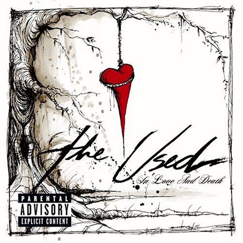
The Used – In Love and Death: The album artwork here is done by Alex Pardee. I love how simplistic his use of line and colour is. It’s creepy and yet still whimsical. Very Tim Burton.


Gorillaz – Plastic Beach: I couldn’t go on about album covers without throwing them in somewhere. The album cover for their latest album is the most extensive in terms of artwork, and also the most colourful.


I have, of course, more influences than this but I’m trying to save space!

So, not only do I have to do an amazing album cover, I also have to create some collectables to go with it. My initial ideas were your typical album collectables: stickers, badges, posters, etc. But I’ve also come up with the humorous idea of creating some comic trump cards of each of the band members. I think they’d find it quite funny, they all have a good sense of humour.


Also, I will be aiming to make a small single cover for a CD as well as a DVD cover for them to use when they eventually distribute them.

But for now, I’m going to experiment and play about a bit!

And if that wasn’t enough, I have managed to manipulate the Negotiated brief to suit me as well! It’s a self-written brief that interprets Liverpool in some way. I am going to create an audio-plus-map tour of Liverpool, using only the music of The Beatles. Dan suggested I call it The Musical Mystery Tour, which I really liked.

So the full title is: The Beatles' Musical Mystery Tour of Liverpool!

I’m off to the great city tonight for my usual helping of Liverpool One (to see Iron Man 2), Worlds Apart, Quiggins and the Tea House Cafe for my Udon Noodle soup with pork dumplings. But more importantly, for research, to snuff out the most notable, inspiring and fun locations for my musical map idea. I’ll be taking my dictaphone to record any thoughts I have along the way, and a camera to snap some photos.

My plan is to create a quirky mini-map of Liverpool that corresponds to a compilation of Beatles tracks that I will put together on a CD and my iPod. Obviously because of copyright issues I may not be able to stream the track listing online, but I will post it in a blog, along with my downloadable map in case anyone wants to give the tour a go.

Dan Berry showed me a funky piece of work by a student last year who created a pocket book of band names, which folded out like a map and was screen printed onto newsprint. I thought it looked great and it was really simply put together, so I’m going to use it as my main inspiration for the finished piece, but with major changes. I like the idea of screen printing the map, it’s a quick and re-usable process. However, I wouldn’t do it on newsprint as it could tear easily. What I’m thinking is perhaps doing an A3/A2 map that will either be laminated for protection, or can be packaged with the CD in something fancy.

But first, it’s super-research-weekend-fun-time!

Comic Review: The P.L.A.I.N Janes


I picked this up off the classroom shelf the other day, annoyed for two reasons; firstly, because my tutors hadn’t shown up; and secondly, because I was planning to write a comic in my third year called “Plain Jayne”, about my life. Just goes to show how original I am.

As always, watch out for spoilers.

Written by Cecil Castellucci, with artwork by Jim Rugg, The P.L.A.I.N Janes follows, you guessed it, Jane, a girl who has just survived a terrorist attack in her home city. The attack disrupts her life, turning her from a fashionable blonde city girl, into an emotional art-freak with a bob of black hair. Her paranoid parents move from the city to the cosy, but ultimately boring, suburbs.

On her first day of school Jane is invited to join the popular girl’s table, but rejects them in favour of a bunch of misfits who ironically are called Jane, Jayne and Polly Jane. This was the first thing to irk me. I know this can happen in real life (I once knew four Emmas in the same class) but I found it so predictable. The term Plain Jane can refer to any girl of limited presence. I found it a bit lazy to name them all Jane.

“Main Jane”, the protagonist, is your typical I-feel-everything art student, almost emo-like. She has a few redeemable qualities, but as a whole character I found that I couldn’t connect with her constant moping. Perhaps because I’ve never been in a terrorist attack.

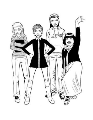
Then we have the other three Janes. Theatre Jane is an overly dramatic, over-weight Shakespeare-spewing stereotype in a scarf. Brain Jane is a big nerd. And Sporty Jane is an athletic chick with a monobrow. What we have here is the Disney Channel show, Recess. Main Jane is a combination of TJ and Spinelli, whilst her comrades resemble Mikey, Gretchen and Vince.


Now I’m all for minor clichés and stereotypes, but I like to see something original in a character. For this reason, I could not connect with any of the main characters, because they were all very hollow. I found that by the end of the story, I couldn’t care less about them.

Now the story, it had some promise. Main Jane, trying to rebuild herself as an artist, tries to inspire her neighbourhood to be creative by performing art attacks with her friends under the guise P.L.A.I.N: People Loving Art In Neighbourhoods.


The idea is cute, and a good way to inspire the town. However, it doesn’t appear to work. Apart from inspiring some of her fellow high school students to sing randomly in class, she never comes close to helping her overprotective mother to relax her rules, or the town’s adults ease up and see her projects as art and not graffiti. There seems to be no resolve to the story, and no sense to the random acts of creativity that P.L.A.I.N produce, which is a shame because they had some great ideas, such as filling the town fountain with washing up liquid, and planting hundreds of garden knomes outside of the police station in protest.

Their final act ends in disaster, and leaves the book’s love interest facing expulsion, and yet none of the Janes do the honourable thing, which would be to come clean and confess. Instead they all carry on with their increasingly dull lives, and this left me both wishing for more, and yet not wanting to read it.

The artwork however is remarkable. It’s a style reminiscent of Daniel Clowes (see below). However, where The P.L.A.I.N Janes fails is that it pretty much tries to be Ghost World, with the loser characters and anti-climatic ending, but it never reaches the same brilliance because it is aimed at a totally different audience. Ghost World is aimed at those who’ve seen all, done all, lived through it and accept that life does, quite eventually, suck. The P.L.A.I.N Janes tries the same route, but aims it at younger teenagers, still in high school, who don’t want to know that life is hard yet.


This is why I believe the book failed to grasp me. It tries to be too smart and too original before it’s time. I understand there is a sequel called Janes in Love, but I don’t feel compelled to go out and read it.

I’d recommend this to you for the interesting creativity ideas put forward. I particularly like Main Jane’s motto: “Art Saves”. But story-wise it’s completely forgettable. Unless perhaps you’re a fourteen-year-old emo girl.

Thursday, 29 April 2010

Dan’s Reel Reviews (no, it’s not a spelling error)

I love my boyfriend enough to encourage him on his sometimes strange ideas, and not to bullshit him if I think he’s full of hot air. But when he came to me spouting notions of his own radio show (in due time) I did think it was a brilliant idea.

In advance Daniel, I know you won’t mind me telling your life story, but I’ll warn you about it anyway.

Dan left Glyndwr University a few years ago with a well-earned degree in Film Making. However, there were no films to be made, and no job for him. So since then he has been puttering around, waiting for something to happen, and apart from a few undeveloped film ideas (Queers of War being my favourite) he has done nothing to further his dream of becoming a film maker.

Until now.

I approached his radio show with the same enthusiasm as his other ideas, but I really think this one has a lot of potential. Dan has a natural performing spirit about him, always the centre of attention. If he’d tried it, he probably could have gotten into acting.

His podcast, named Dan’s Reel Reviews, allows him to do what he loves, which is watch loads of films, then pick them apart like any good critic. Although there are times when we do not always agree on what makes a good film, I do admire his reasoning, and he has a great radio voice.

This week marks the second week of his podcast, which you can listen to here. He reviews a recent cinema release (which is great because I get to go see more films), a recent DVD release and a “Hidden Gem”, which is a genre movie suggested by his listeners every week.

The upcoming show will feature a review of Date Night, Avatar and As Good As It Gets.

I am very proud of him, and will be standing by, making sure he does it each week and doesn’t let it fall into disrepair. However, I am also his biggest critic and am constantly giving him tips on how to improve. So no, I’m not biased.

Well… except he did let me do the logo for his group on facebook…


You may call this blog shoddy advertising, but I’m not being paid. However, he’ll probably treat me to the cinema this weekend!

Hell I may as well throw in a last bit of self-advertisement! Here is the link to my own facebook group about my freelance work, on which you can contact me about commissions:

Jemima Lee – Freelance Artist

Shameless, I know!!